
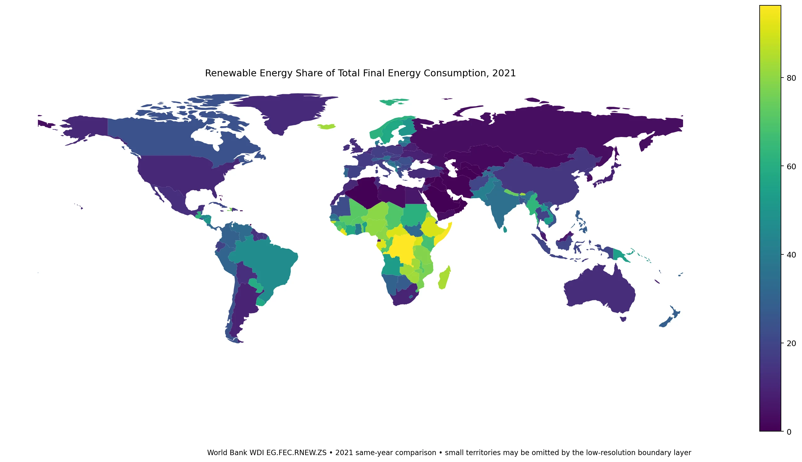
This map visualizes the percentage of total final energy consumption supplied by renewable sources across 212 countries using 2021 World Bank data. Unlike electricity generation maps, this metric includes direct use of biomass, heat, and transport fuels, revealing that high renewable shares often stem from traditional biomass rather than modern wind or solar technology.
Data Scope and Global Distribution
The dataset covers 217 World Bank economies, with numeric observations available for 212 nations. Five territories—including Channel Islands, St. Martin (French part), Monaco, San Marino, and Kosovo—are excluded due to missing data. The global unweighted mean stands at 29.1%, though the median is lower at 20.3%. The distribution spans nearly the entire 0% to 100% range, with the lowest value recorded at 0.0% (e.g., Bahrain, Qatar) and the highest at 96.3% (Democratic Republic of the Congo). While 49 economies exceed 50%, a significant 89 nations remain below 15%. This wide variance highlights that national energy systems vary drastically in structure, with some relying heavily on modern renewables while others depend on traditional fuels.
Regional Contrasts and Major Economies
High renewable shares are frequently found in Sub-Saharan Africa, where countries like Somalia (95.4%) and Liberia (93.2%) lead the rankings. These figures often reflect substantial direct consumption of traditional biomass rather than advanced grid technologies. Conversely, developed nations show lower overall shares despite high renewable electricity generation; for instance, the United States sits at 10.9% and Japan at 8.8%. In contrast, Iceland reaches 82.4% driven by geothermal and hydro power, while Norway stands at 61.4%. Large Asian economies also display diversity: India records 34.9%, whereas China is at 15.2% and South Korea at 3.6%. The indicator treats all energy forms equally, meaning a high percentage does not automatically signify a modern, decarbonized grid but can indicate widespread use of biofuels or solid waste.


0 댓글